Unlike My Little Pony with their Bronies, which are guys that love the candy colored critters, Hello Kitty has not been as an easy sell for guys. Enter the genius of Japanese design studio Nendo with their line of tees aimed at making the iconic white kitty palpable for guys. Now bear in mind, the reasoning behind this is due in part to a collaboration with PEN, the men’s lifestyle magazine, which required Hello Kitty tees for the fellas.
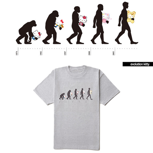
Evolution Kitty (above) is intended as a reference to the character’s subtle design evolution over the past 40 years. Nendo told dezeen, ‘Since her debut in 1974, Hello Kitty has been subtly evolving through the years, incorporating design trends concerning her contours, three-dimensionality + facial features. The design draws attention to Kitty’s continuous evolution, by superimposing her on the classic illustration depicting human evolution.’
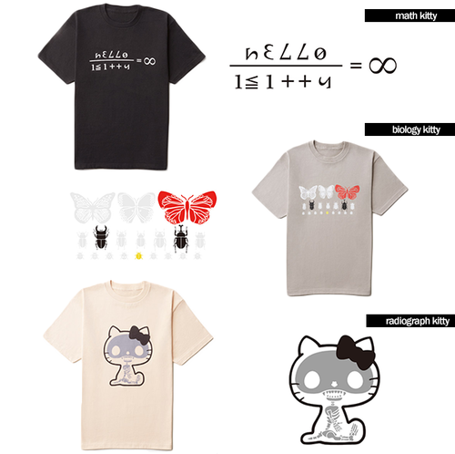
Math Kitty (below) uses numbers + mathematical formulas to create a graphic, with the infinity symbol ∞ also intended to reference the hair bow worn by the cat. Biology Kitty features an image of Hello Kitty’s face made from insects, with a butterfly to represent her bow, a black Japanese rhinoceros beetle + a stag beetle for eyes, + a scarab beetle acting as her nose.
Nendo Studio told dezeen, ‘Hello Kitty is a character that has many elements that ‘stimulates the right brain’ to naturally induce the feeling of ‘cuteness’, On this basis we thought up a way to appeal to a new target group by ‘stimulating the left brain’.’
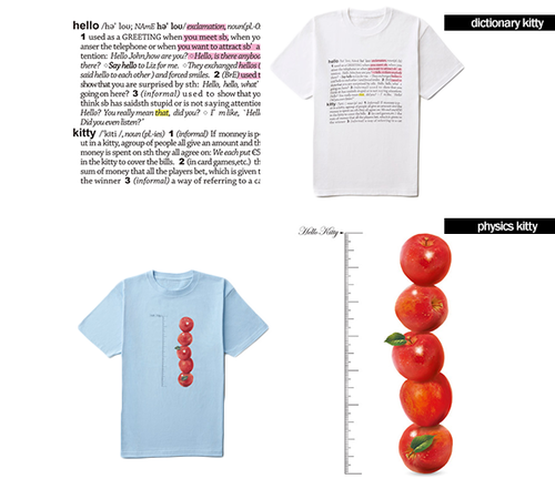
Dictionary Kitty shows extracts from a dictionary with the definitions of hello + kitty. These have been highlighted in yellow, to reference the colour of the character’s nose, + pink to allude to the colour of her bow. The design for Physics Kitty ‘serves as a reference for Kitty’s height as equal to five apples, which are placed next to a scale,’ said Nendo.
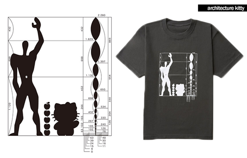
The tee collection is comprised of eight different prints called Radiograph Kitty, Math Kitty, Dictionary Kitty, Architecture Kitty, Biology Kitty, Physics Kitty, Art Kitty + Evolution Kitty. My favorite by far is the Architecture Kitty (below) with all of its lines + numbers. Architecture Kitty is ‘based on the sketches of Le Corbusier, known for his anthropometric ‘Modulor’ system of proportions,’ said Nendo, adding ‘When designing architectural spaces, the Kitty Modulor design was made, featuring Kitty raising her right arm +, next to her, five apples to mark her height (Kitty is five apples tall).’
And of course, the tees are still unavailable.
(via dezeen)
