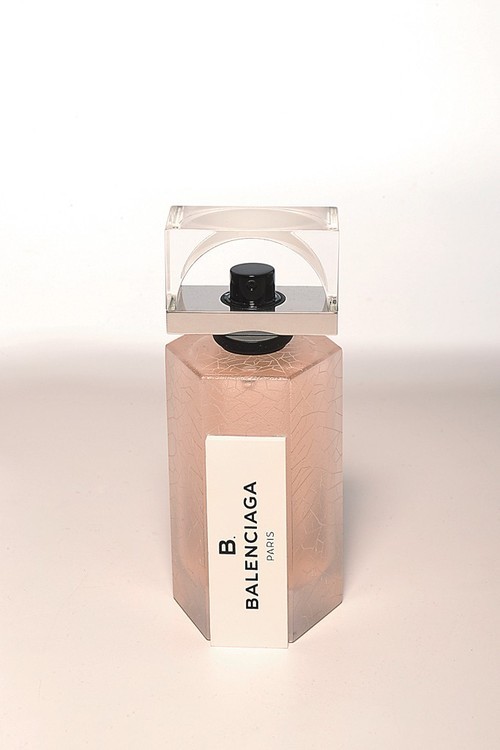
A sucker for packaging, the bottle for Alexander Wang’s first Balenciaga fragrance B Balenciaga, has me drooling. It’s crazy how it looks modern yet vintage at the same time, which is exactly what Wang set out to do. He told WWD, ‘It took a lot of soul-searching, but I really wanted to do something quite pure, as I see it as a step forward for the house. It was exciting working on the scent + going to the essence of the brand, to its DNA, + to also combine that with my vision. Designing fragrances + designing clothes + accessories are both emotional. But fragrance is much more scientific, while in bags, shoes + clothes, there are a lot of tech parameters. With fragrance, it’s a whole different ball game. I’m always up for a creative challenge, though — I love to explore and dig up why something has to work the way it does.’
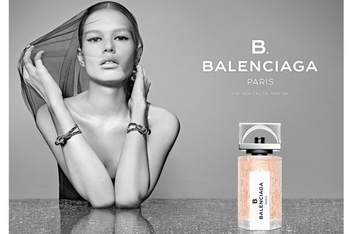
Even the ad below, has both of those qualities, from the sheer veil over the

model’s face, reminiscent of many ads from the late Seventies along with a bottle design that follows in the same direction but still remains true to contemporary esthetics. The ad should be running in fashion magazines come October.
The marble flooring of Balenciaga’s original Paris store is present by the crackled glass of the fragrance bottle, which is also reminiscent of the marble theme present in Wang’s first collection for the house. Then you have the exposed arch of the cap intentionally referencing the arches found in Balenciaga’s modern fashion + accessories. I just love the geometric + architectural aspect of the bottle as a whole, not to mention the graphic panel bearing the fragrance’s name.
(via WWD)
